
Alissa Eckert received a phone call one morning in January from her employers at the CDC. A new virus that had originated in China was spreading rapidly, the public needed to understand the gravity of the situation, and there was no time to spare.
As a trained medical illustrator, Eckert BFA ’04 is an artist with a deep understanding of the life sciences and visual communications.
For her, the task was clear: create an arresting visual that would give the virus an identity and make tangible something people couldn’t see with the naked eye. Eckert teamed with longtime collaborator and fellow medical illustrator Dan Higgins BFA ’93 to create what became the iconic image of SARS-CoV-2, the virus that spawned the COVID-19 pandemic.
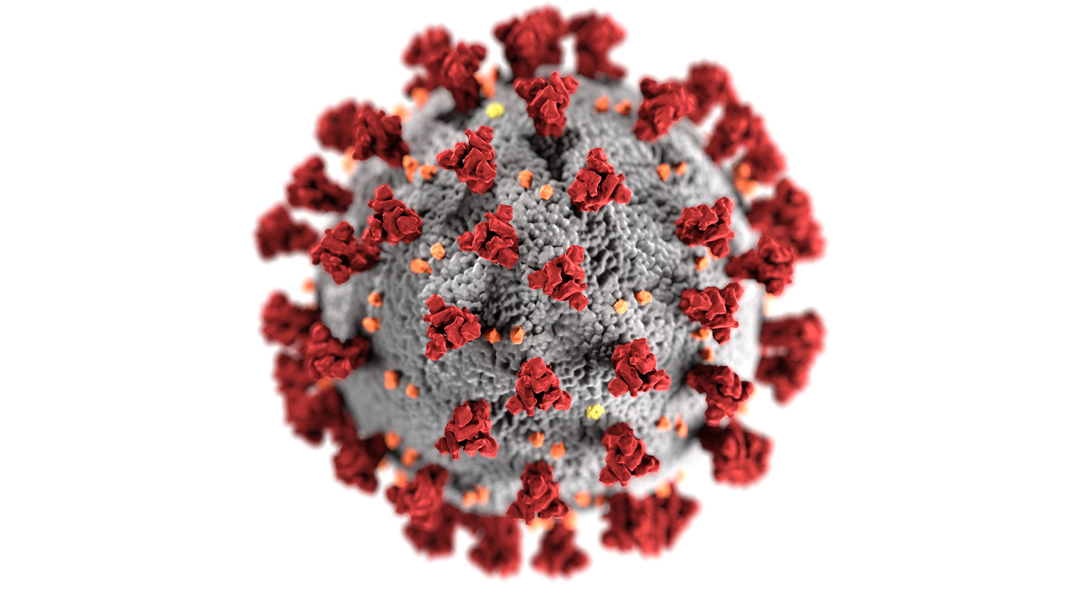
Soon, the image they developed, featuring a gray nucleus spiked with red, orange, and yellow surface proteins, was everywhere. Google “COVID-19,” and there’s a good chance their image will be the first one that pops up.
Eckert and Higgins have worked together for 14 years. Before that, they both earned degrees from the Lamar Dodd School of Art, although they were more than a decade apart. Now, they are on the CDC’s eight-member Graphic Service Branch—five of whom are UGA alumni—with the goal of visually bringing the CDC’s messages to life.
To get the image to the public as quickly as possible, they streamlined the process for the coronavirus project. But Eckert and Higgins didn’t cut any corners.
To get started, they went to work researching and posing questions to the experts in the CDC’s labs.
“We’re not experts in coronavirus, but we have a basic understanding of viral structures,” Eckert says. “We know what kind of questions we need to ask the scientists.”
Armed with that information, Higgins jumped on the World Protein Data Bank and downloaded images of each of the three main proteins that make up the virus. Eckert then combined the pieces to begin to form the now ubiquitous image. Working with CDC scientists, they identified how much of each surface protein to show and how far apart they should be. As a final flourish, they added dramatic lighting to give the image its ominous look.
“We didn’t want to scare the public,” Higgins says, “but we did want them to take it seriously.”
After an intense seven straight days of work, the pair finalized the image. What they created was a high contrast image with sharp details and textures, elements that bring the virus to life and make it seem real.
Since January, both have been inundated with jobs to help the CDC amplify messages during the pandemic from illustrating COVID-19 symptoms to explaining what contact tracing means. Like a lot of us, they’ve been working mostly from home
“It’s pretty much non-stop, ASAP mode,” says Eckert.
In that time, the duo has seen the image appear on cable news shows, websites, late-night talk shows, even recreated as cupcakes and cookies. They’ve heard anecdotes of people visualizing the graphic before they put on a facemask when going to the store. In other words, the image has bored into the public psyche. For them, that means they did their jobs.
“I think it shows the power of what an illustration can do,” Higgins says. “We sought to create an educational tool, one that hopefully would change behaviors.”
The Image Explained
The red protrusions are Spike or S proteins. These clumps of proteins attach the virus to the host cell. The spikes create a halo effect, or corona, around the virus.
The yellow specks are Envelope or E Proteins. They’re the smallest of the three main proteins that make up the virus. These are the proteins that punch through healthy cells’ walls to infect them.
The orange crumbs in the image are Membrane or M Proteins. The most abundant of the three proteins, this protein fuses with the membrane of the healthy cell.
The gray surface is the body. This represents the envelope that surrounds the nucleus of the virus.