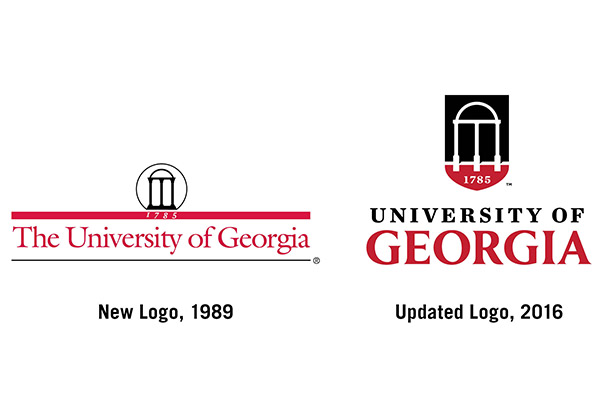
UGA has updated its academic logo with all of the familiar elements of the old: the signature red and black, the iconic Arch and the university’s founding date as the nation’s first state-chartered university. The logo was updated in preparation for the launch of the public phase of the comprehensive capital campaign in November.
Debuting with UGA’s public service announcement during the Sept. 3 football game, the university logo is part of the institution’s new visual identity system, which will use consistent colors, fonts and design elements to align the university’s many schools, colleges and units. Like most U.S. colleges and universities, UGA will continue to have distinct athletic and academic marks.
“This is an evolution of our prior logo, and it visually represents the University of Georgia’s rich history, current success and aspirations for the future,” said Karri Hobson-Pape, vice president for marketing and communications. “By using a refreshed and coordinated visual look, we will build greater recognition of the university’s positive impact throughout the state, nation and world.”
The updated logo and the overarching visual identity system were developed with input from UGA students, faculty, staff and alumni. The previous academic logo was designed in 1989, long before digital and social media became dominant forms of communication. That logo was challenging to use in the digital realm, where bold and flexible graphics thrive.
In addition to the university’s trademarked academic logo, the university’s various schools, colleges, departments and units have used a variety of other logos on their websites and printed materials. Moving forward, all academic entities will adopt the new unifying visual identity system.
“A unified look and message enables us to present a comprehensive picture of a university whose component parts are working together and accomplishing great things,” said Kelly Kerner, vice president for development and alumni relations. “When our alumni can understand the impact their university is having in the state of Georgia, they are more likely to invest in the success of our students.”
The updated logo consists of a bolder Arch contained in a shield, which helps the logo stand out in a variety of backgrounds, coupled with custom typography for the university’s wordmark. Shields are used in many leading college and university logos, including a number of institutions represented by the Association of Public & Land-grant Universities.
“As the university prepares to launch the public phase of its comprehensive capital campaign, it is important to use a clear and consistent visual identity to convey the profound impact of our teaching, research and service missions,” said UGA President Jere W. Morehead.
Later this month, the Division of Marketing & Communications will launch a brand toolkit website, which will include information about the new visual identity system. Under that system, schools, colleges and units will work to define their logo needs, and UGA Marketing & Communications staff will provide the updated logo files. Emphasis is being made to ensure that existing print materials with the 1989 logo are not wasted; new materials are to be ordered only once the old materials have been used.
Community input
Last spring, 25 public listening sessions for faculty, staff and students were held to determine the community’s functional needs for a logo as well as preferences for a new visual identity system. In addition, focus groups and interviews were conducted with alumni in Georgia and elsewhere. More than 300 students, staff and faculty participated in those input sessions, and the overwhelming consensus of participants was that the university needed to update the logo and implement a consistent visual identity system across the institution. Participants in the sessions also strongly preferred that the Arch, the university’s enduring academic symbol, continue to be used in the refreshed logo.
“We reviewed the logos and visual identity systems of 60 universities to learn best practices for visual identity systems,” said Hobson-Pape. “Most top universities have been updating their institutional logos over the past two decades, and we spent time reviewing that work.”
The updated design received favorable reviews when shared with alumni leaders in Athens and Atlanta in July and informally with students who were on campus.
The new academic logo expresses the university’s striking and ambitious spirit, said Chris Garvin, director of the UGA Lamar Dodd School of Art, who provided input into the process.
“This new mark carries on the tradition of the old 1785 circular mark but modernizes it and adds a gravitas,” Garvin said. “The shield gives it power and the kind of heraldry the best universities play on. I call it the ‘Power Arch’ because it holds its own next to the Power G.”


