
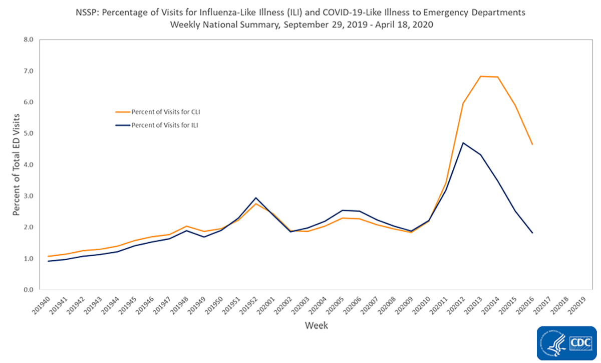
From the White House and the Centers for Disease Control and Prevention to CNN and the New York Times, media coverage of COVID-19 continues to surge, with many outlets using mathematical models, including graphs, percentages and exponential growth, to relay information to the public.
However, existing STEM education research shows that mathematical topics commonly used in media representations are difficult to understand for a large portion of the U.S. population. To address these issues, researchers at the University of Georgia and across the nation are conducting a qualitative study to investigate people’s understanding of data representations in COVID-19 media coverage and how these outlets can redesign current representations to enhance the public’s understanding of crucial information.
“A lot of data are presented on logarithmic scales by media outlets,” said Cameron Byerley, assistant professor in the UGA Mary Frances Early College of Education’s department of mathematics and science education and principal investigator on the study. “Logarithmic scales are not taught in high school Common Core standards, and so our goal is to present data in ways that make sense to people who’ve just gone through the Common Core standards.”
Currently, Byerley and her research team are conducting interviews via Zoom with both U.S. and South Korean participants to gain insight about their understanding of mathematical models as the pandemic unfolds. Additionally, the team is interested in how participants form their social distancing choices based on their perception of the pandemic’s current risk and severity.
Byerley’s pilot findings suggest that people have difficulty using data representations to make decisions about their personal and community health risks, further indicating the need to redesign mathematical models.
Byerley’s team will form connections with journalists and news producers to help these outlets produce better representations that aid people’s understanding of quantitative data on the coronavirus.
They also plan to create representations of COVID data using animations to show the passage of time. “If a graph is moving and the experience of time is built into it, people don’t have to track the change of time on the axes—it would just be built into the animation,” she said. “We’re finding that animation is easier for people to digest. Because instead of having to read time and other measures simultaneously, time just moves for you.”
Other recommendations may include showing a video before data representations are presented on a website to explain what kind of graph people are viewing (linear vs. logarithmic); highlighting any interval changes on the graph’s axes; or offering built-in animations for certain measurements, such as time. By incorporating these new elements and drawing on existing STEM concepts, the team hopes to help individuals make better data-informed decisions related to their health.
“We’ll be able to make stronger conclusions about how people are understanding representations of COVID-19 data,” said Byerley. “When we started the interviews, we discovered we could make graphs better with some tweaks. This is our way to impact the world right now.”
In addition to Byerley, the study’s research team includes Kevin Moore, an associate professor in the Mary Frances Early College of Education; James Drimalla, a UGA doctoral student in mathematics education; Hyunkyoung Yoon, a faculty associate at Arizona State University; Surani Joshua, an instructional professional at Arizona State University; Min Sook Park, an assistant professor at the University of Wisconsin-Milwaukee; and Laura Valaas, a doctor of medicine student at the University of Wisconsin.